Searchability
And Engagement
Optimize MET Online Collections’
My ROLES
Facilitate user research and create timely reports based on data from diverse sources. Formulate three actionable recommendations with high-fidelity prototypes and evaluate the effectiveness of new features through subsequent A/B testing.
TEAM
Arthi Sundararajan
Eva Chen
Sebastian Hunt
Xinyu Wang
CLIENT
The Metropolitan Museum of Art
DURATION
20 Weeks
How can we help users find what they are looking for and encourage them to explore more?
OVERVIEW
PROCESS

1. EXPLORE
Online collections are the first touchpoint for over 70% of the visitors to the museum website.
INTRODUCTION
The MET (Metropolitan Museum of Art) in New York City is one of the world's most iconic and visited museums. Apart from visiting in person, the general public can also explore the MET’s online collections, where these objects and artifacts are digitized meticulously.
3,580,000
540,000
Digital Records
600,000
Monthly Visitors
Monthly Session
“We want to learn more about what people do on the collection page, what content they are most interested in, and whether they can find what they want.”
RESEARCH GOAL
Initially, we held a kickoff meeting with the client to understand their needs and objectives. Then we consolidated previous research findings and gathered insights from our design team. Based on this, we identified the following three key research goals.
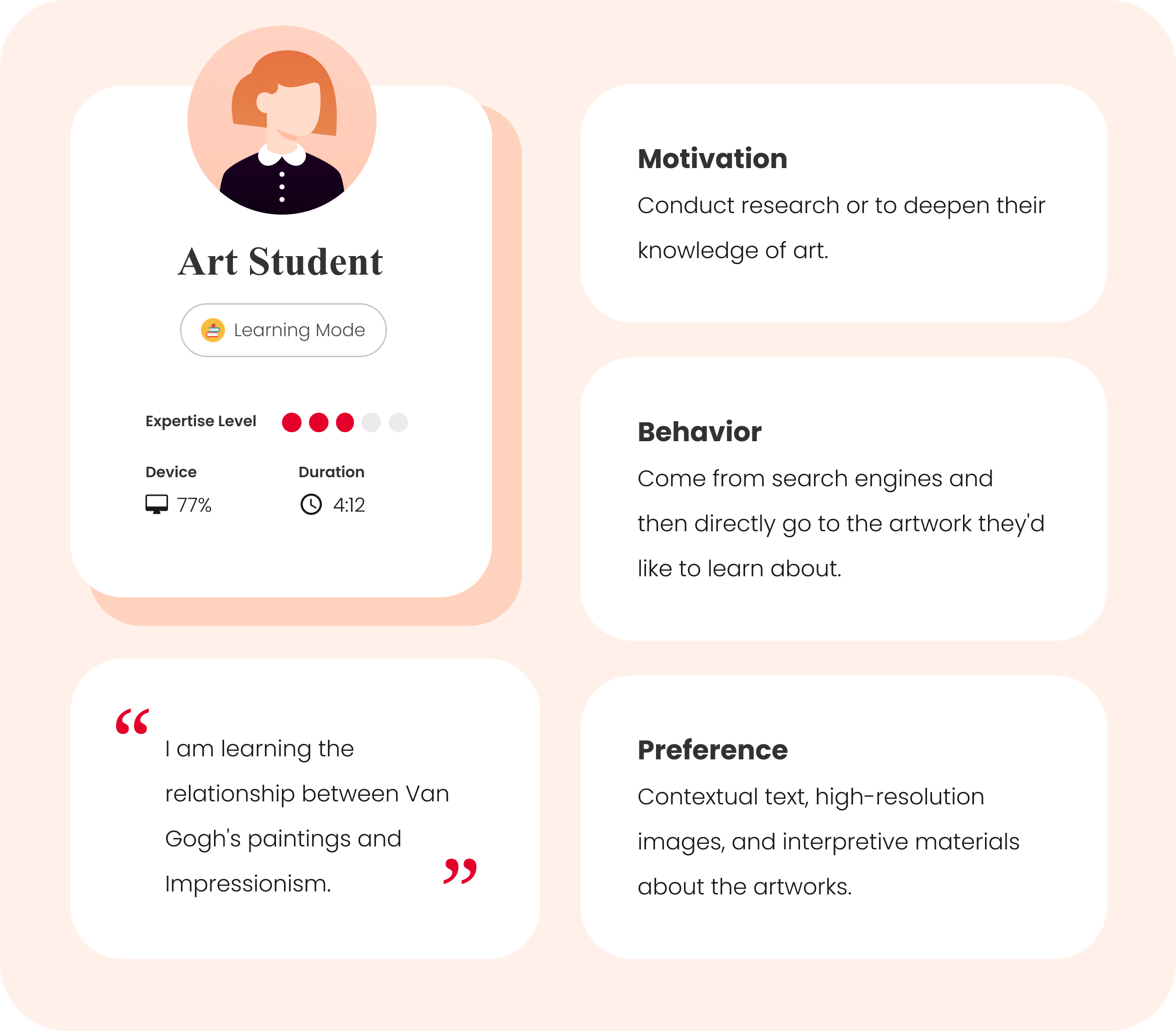
Most of the users are art students who come to conduct research and art enthusiasts seeking inspiration.
USER PERSONA
Google Analytics reveals that 63% of online collections visitors are aged between 18-34, and 72% are new users. A previous user survey also showed that most users are young individuals with broad interests but general expertise in the arts.
Considering their motivations and behaviors, we have identified two primary User Personas.
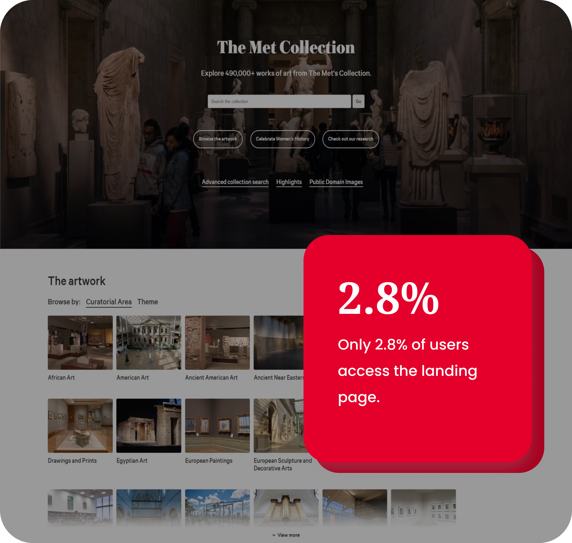
72.5% of users reach specific artwork pages via keywords from organic search or through referral traffic channels like Pinterest.
BEHAVIOR ANALYSIS
Therefore, although the landing page is important, our primary focus is on optimizing the user experience beginning with artwork pages and guiding users toward other relevant content.

2. RESEARCH
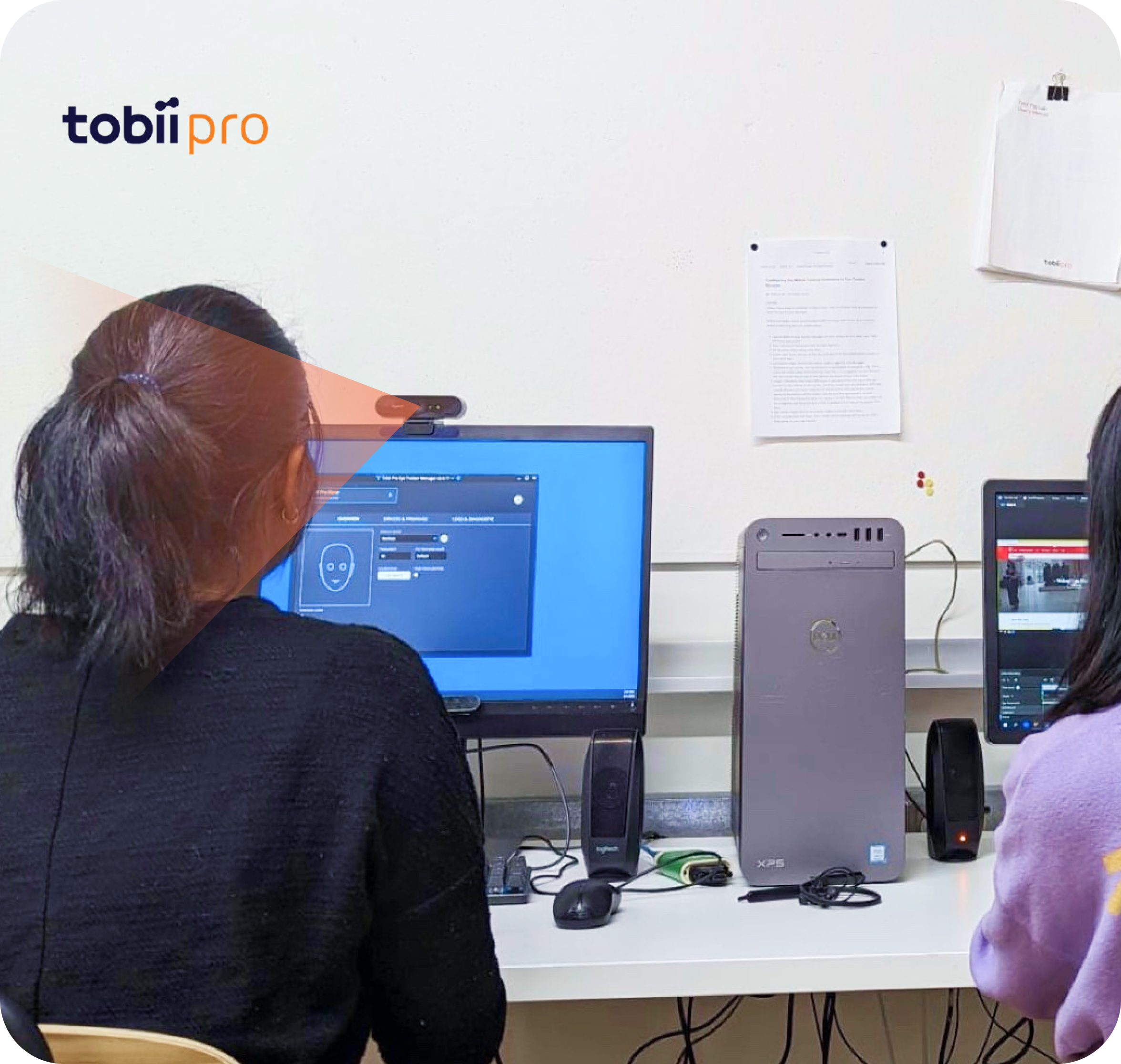
Eye tracking helps us determine which contents get the most attention and what information users are actively searching for.
METHODS
We used the Tobii Pro eye tracker to record the participants’ eye movements and capture where they looked as they completed each task. Following each task, we employed a retrospective think-aloud method to gather their thoughts. This approach allowed us to gain deeper insights into their decision-making processes.
By evaluating featured artworks, we can specifically identify areas for improvement to better serve our primary users.
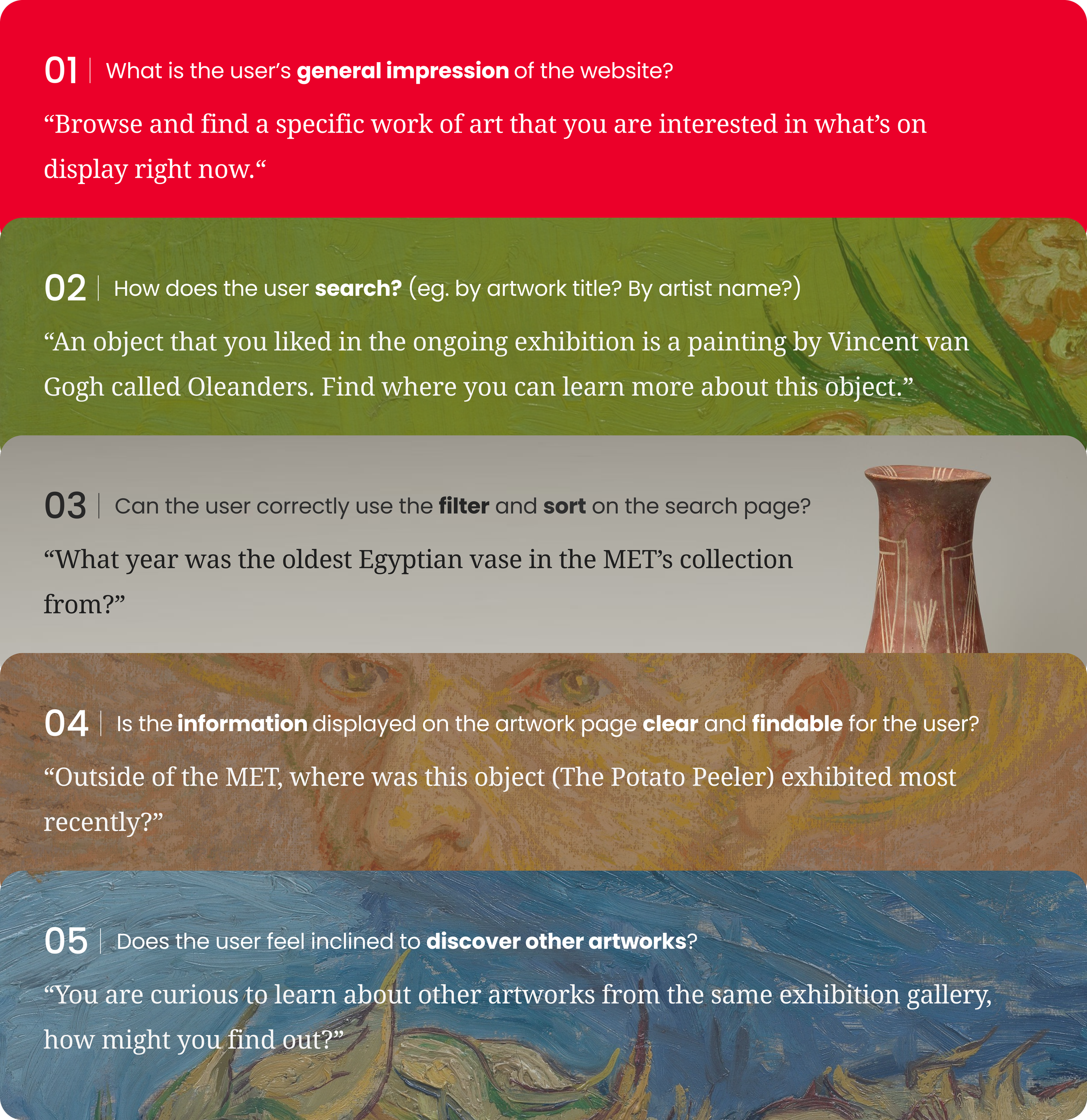
TASKS
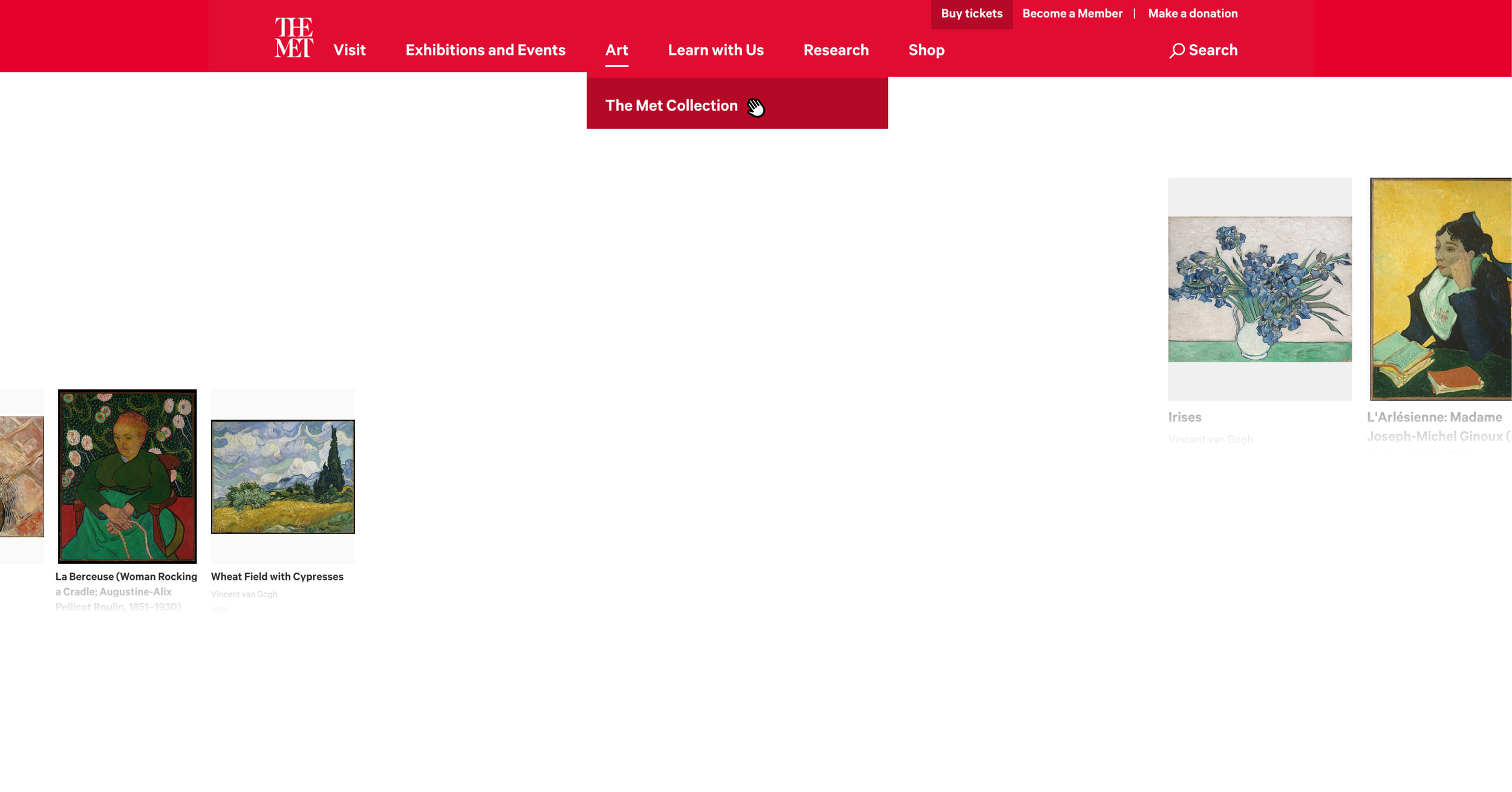
Based on Google Analytics, 67% of users searched for artworks that ranked in the top 20 in popularity, with 34% specifically searching for "Van Gogh" as a keyword. Therefore, our testing primarily focuses on Van Gogh's artworks to better understand the users' actual experience.
We recruit users from art schools and online artist communities.
USER RECRUITMENT
Based on the user personas, we created an online screening survey and sent it through the Pratt college email list and artists' Facebook groups. Since our target groups have already been narrowed down, our screening questionnaire is more detailed than general ones, which helps us find the most suitable users.
With careful project management, we completed 16 user testing sessions within two weeks.
PROCESS
Before testing, we scheduled user visits and lab sessions using spreadsheets and assigned appropriate moderators. During testing, detailed scripts helped us run the tests smoothly and stay on time. After testing, we properly labeled and stored all documents and recordings, greatly simplifying data analysis and archiving.

3. IDENTITY
Overall, users find the website easy to use and visually appealing.
OVERVIEW
Users gave an SUS (System Usability Scale) score of 86.6, which is significantly higher than the average score of 66.9. This indicates that the system is performing well, with users encountering almost no usability issues that hinder them from completing tasks. Therefore, our focus will shift towards optimizing and introducing new features.
“The pages are too long and require endless scrolling, making it hard to find interesting content. It seems designed only for professionals.”
ISSUES
In our experiment, we identified several issues hindering the user experience. The following user journey map highlights common user complaints. Based on this feedback, we have established specific improvement goals.

4. DESIGN

RECOMMENDATION 01
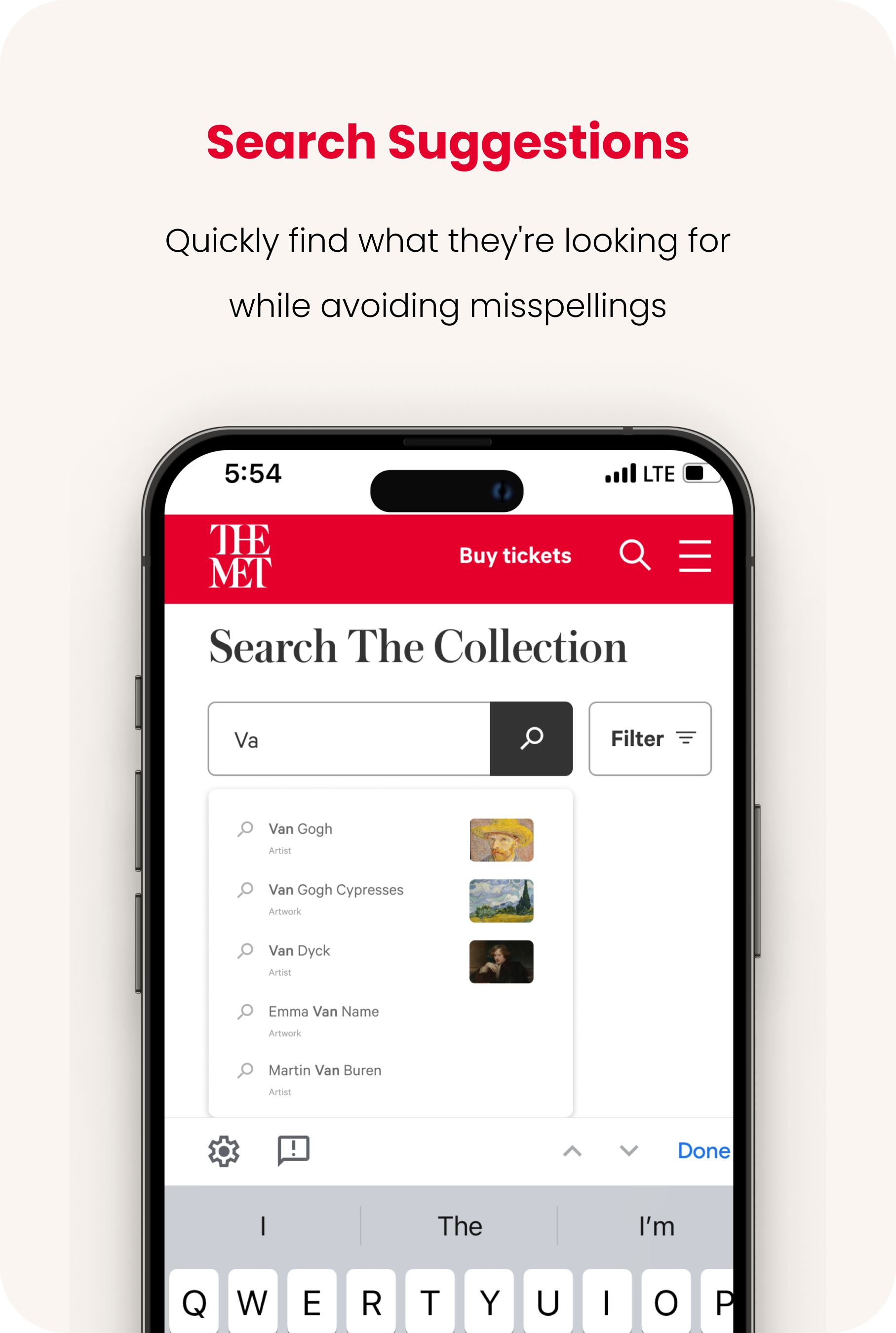
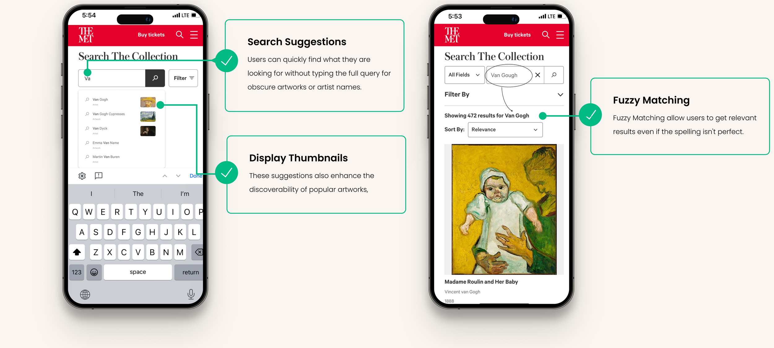
Add Search Suggestions
43% of users misspell "Van Gogh" and get the search result "There are no results found."
FINDINGS
Spelling errors for the names of artists and artworks are common among non-experts. According to Google Analytics, when users encounter "There are no results found," they often abandon the webpage immediately without trying other searches.
Based on A/B testing, when search suggestions were implemented, the Search Success Rate increased by 34.2%, while the time to results decreased by 16.5%
SOLUTIONS
With search suggestions and fuzzy matching, users can quickly find what they're looking for while avoiding misspellings.

RECOMMENDATION 02
Create Artists’ Story Cards
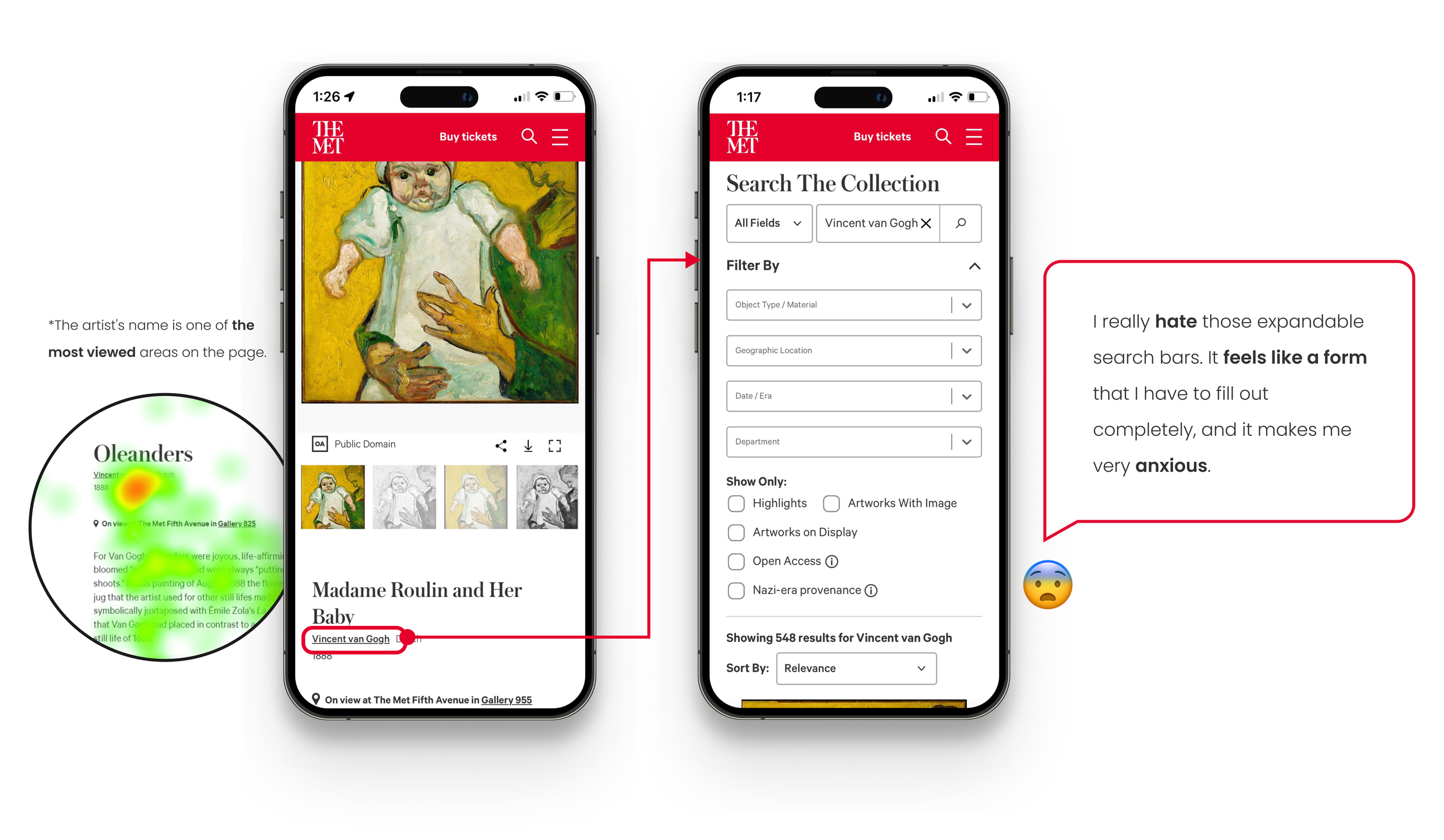
When users want to learn more about the artist, 94% of them click on the artist's name at the top of the page but are redirected to the search page with expanded filters.
FINDINGS
68% of users mentioned in interviews that their experience here was unexpectedly confusing. Additionally, according to Hotjar's data, only 0.08% of users clicked on advanced filters during active searches, indicating that expanding them is entirely unnecessary.
Considering the MET has artworks by tens of thousands of artists, instead of creating a separate artist page for each one, I suggest inserting a story card for a select few featured artists.
SOLUTIONS
The client worried that creating an artist page for each artist would be an overwhelming task. However, creating pages for only some artists would compromise consistency.
Therefore, I suggested adding "Artist’s Stories" and "Exhibition Information" cards to some pages. These cards are already used elsewhere on the museum website, making them flexible and practical to implement.

RECOMMENDATION 03
Incorporate a VR Gallery
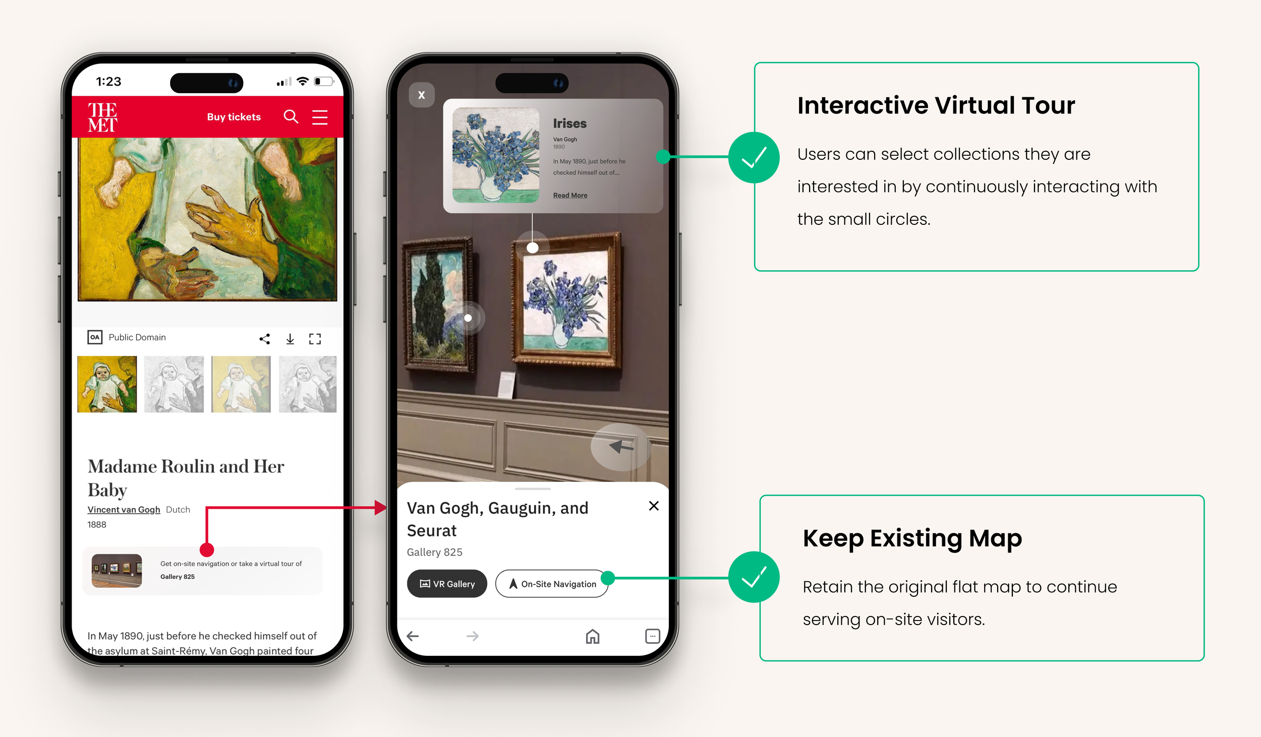
According to user interviews, users are also very interested in other exhibits displayed in the same gallery even when browsing online.
FINDINGS
The museum has always encouraged users to explore more collections, but the map feature at the top only serves a small number of on-site visitors. Additionally, only 12% of users scroll down to the related artworks section at the bottom, and just 2.5% of users click on it.
By expanding the original map feature for on-site visitors into a VR gallery, the click-through rate increased by 385.7% compared to the original.
SOLUTIONS
By integrating virtual tours, we could undoubtedly meet the needs of more users, increase engagement, and create a standout feature.

SUMMARY
The A/B testing and usability testing for the new search suggestions and artists' story cards have been completed. We are awaiting the next overall website upgrade to install these features.
NEXT STEP
The VR Gallery's actual content is quite complex and is still in the conceptual stage. However, it remains a key future project under consideration.
Capturing the users’ attention in a limited space.
WHAT I LEARNED
Big data and eye-tracking tools help me intuitively understand what interests users. Overall, we need to align with their existing user habits while also providing something interesting at first glance to grab their attention.
